How to Decorate a Room with AI
Decorating a room looks like taste, but it is really a sequence of small decisions made in the right order: palette, focal point, layout, light, texture. Get the order right and almost any room comes together. The new part is that you no longer have to imagine the result or buy first and hope. You can see every decision on a photo of your actual room before you spend a cent. Here are the fundamentals designers actually use, then how to put them into practice with AI.
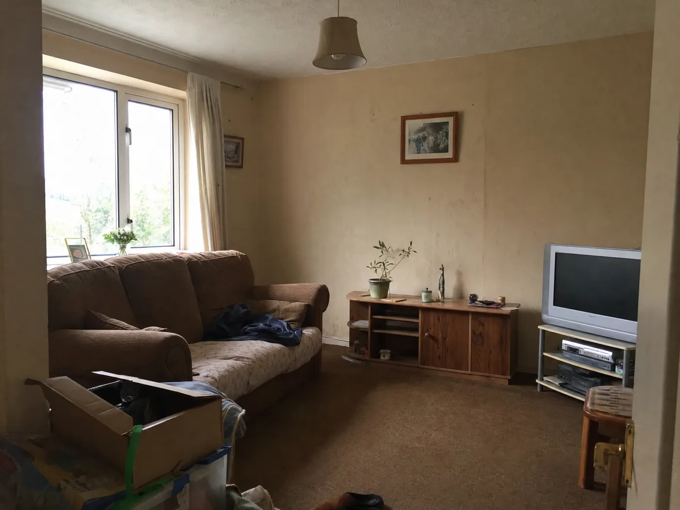
 Before
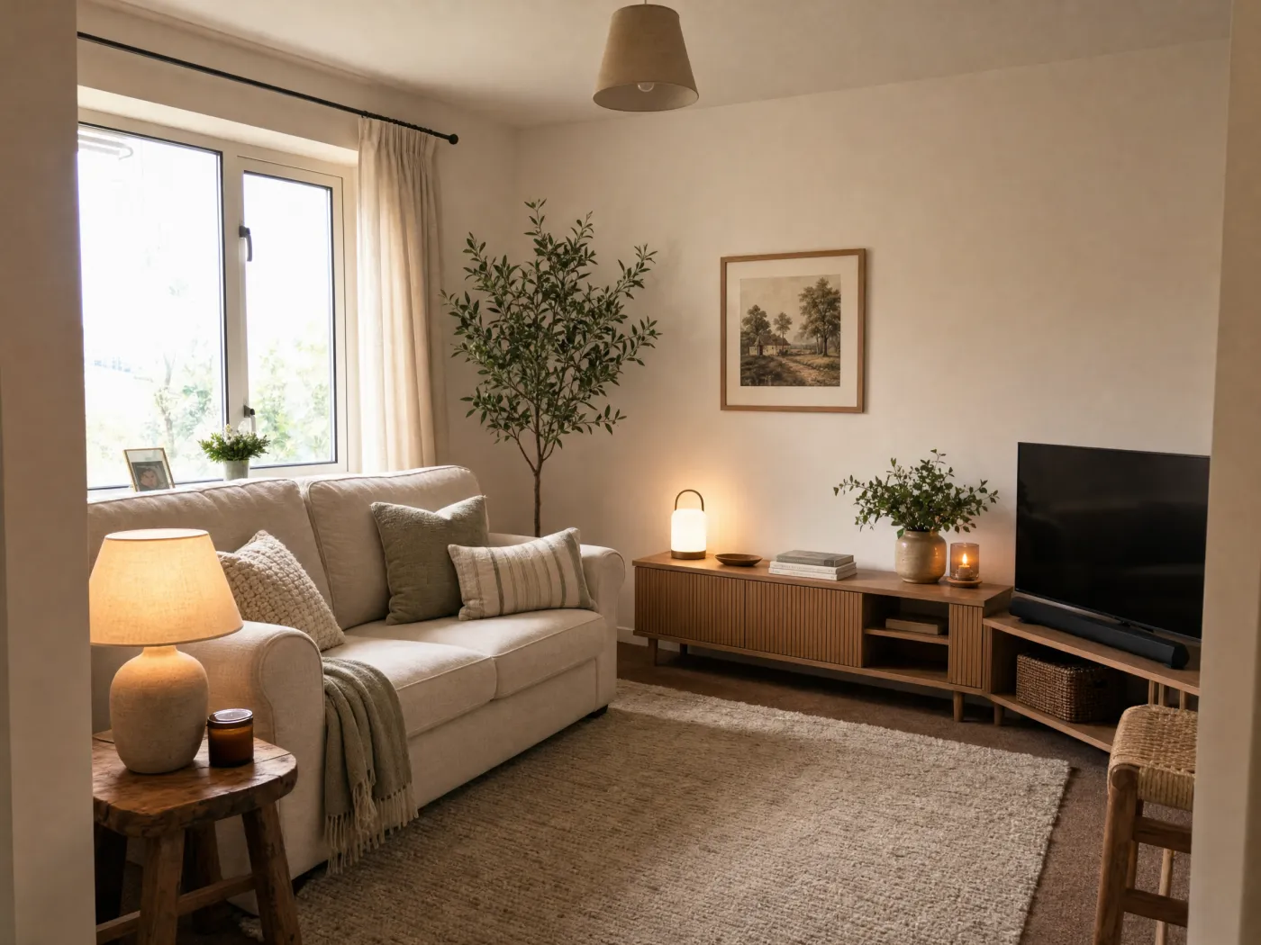
After
Before
After
Part one: the fundamentals
You can skip straight to decorating with AI below, but these are the decisions the AI is helping you make. Knowing them is what separates a room that looks decorated from one that looks furnished.
1. Decide your palette first
Color sets the mood before anything else registers, so settle it before you buy a single cushion. The framework designers reach for is the 60-30-10 rule, a proportion that keeps a palette balanced instead of chaotic or flat:
- 60% dominant color on the largest surfaces: walls, a big rug, the sofa. This is the shade the eye reads as the room's overall color.
- 30% secondary color on supporting pieces: curtains, an accent chair, bedding. Roughly half the dominant, it adds depth and contrast.
- 10% accent color on the small, fun things: pillows, art, a vase, a lamp. This is where a bolder or more saturated color earns its place.
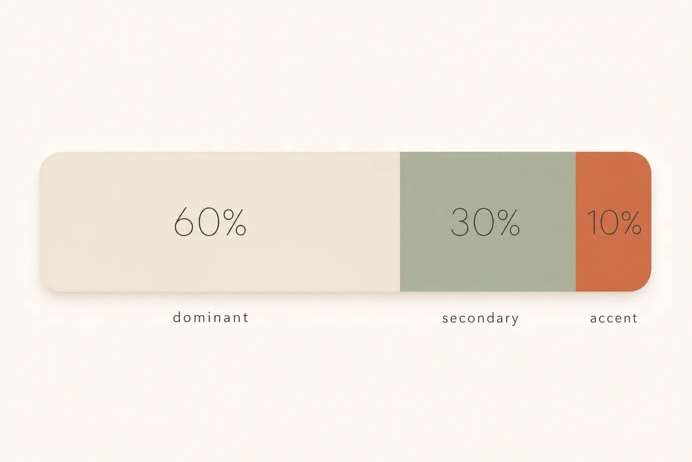
One caveat designers stress: the rule governs proportion, not which colors to pick. Three unrelated colors in a perfect 60-30-10 split still will not work. The colors have to relate on the color wheel, and their undertones have to suit the room. Every neutral leans somewhere: a "white" or "greige" can read peach, yellow, gray, or blue once it is on the wall. A quick way to spot a lean is to hold the sample against plain white paper, where the undertone jumps out. Above all, coordinate with your fixed elements, the things you cannot easily change like flooring, tile, and countertops. When in doubt, match the temperature, warm or cool, of the largest fixed surface in the room.
2. Find or create a focal point
A focal point is the first thing you see when you walk in. It anchors the room and gives everything else a reference, which is what makes a space feel intentional rather than scattered. Usually it is an architectural feature: a window with a view, a fireplace, or in a bedroom the bed itself. If the room does not hand you one, create it with a large piece of art, a mirror, an accent wall, or one statement piece of furniture.
Two rules make a focal point work. Give it its own light so it stands out, and if a room has several features competing for attention, pick one to emphasize and quiet the others. Competing focal points are a big reason a room feels busy without anyone being able to say why.
3. Plan the layout before you buy anything
The most common beginner move is to push every piece flat against the walls. It feels like it creates space, but it leaves a dead void in the middle and makes the room feel disconnected. Designers do the opposite and float furniture, pulling pieces even six to twelve inches off the wall into conversation groups. A few numbers worth taping out on the floor first:
- Walkways: keep 30 to 36 inches of clearance on main paths, 18 to 24 at an absolute minimum in tight rooms.
- Sofa to coffee table: about 16 to 18 inches, close enough to reach, far enough to pass.
- Conversation: face seating toward seating so people can talk without turning, and map how you actually move through the room before placing anything.
Then there is the rug, the single most common proportion mistake. A rug that is too small floats like a postage stamp and makes the whole room feel smaller. Size it up:
- Let it run past the sofa, at least 6 to 8 inches beyond each end.
- Choose a layout: all legs on the rug for the most unified look (leave about 8 inches of rug past the furniture), or the more flexible front legs on, where the front legs of every seat rest on the rug with roughly a third of each piece's depth covered.
- Leave a border of bare floor, about 10 to 18 inches to the walls, less in a small room, more in a large one.
4. Layer your lighting
If one change separates a flat room from a warm one, it is lighting. A single overhead fixture casts hard downward shadows and leaves the corners dark. Every well-decorated room uses three layers instead:
- Ambient: the base layer of even, overall light, from ceiling fixtures or recessed cans.
- Task: brighter, directed light where you read, cook, or work, from table and desk lamps or under-cabinet strips.
- Accent: directional light that highlights the focal point or a texture, from picture lights, sconces, or a well-placed lamp. To actually register as a highlight, accent light wants to be noticeably brighter than the ambient around it.
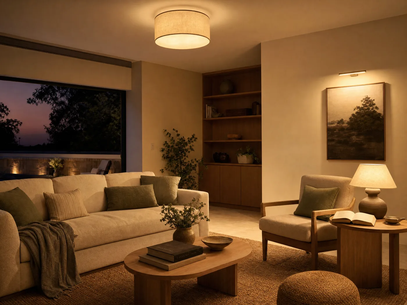
Warmth comes from color temperature, measured in Kelvin. Lower is warmer. For living rooms and bedrooms, stay in the 2700K to 3000K range for a soft, golden, candle-like glow; 3000K to 4000K suits kitchens and bathrooms where you want clarity. One thing people mix up: color temperature is not brightness. Brightness is lumens. Keep the bulb color consistent within a room so the layers do not clash, and aim for several light sources at different heights rather than one in the ceiling.
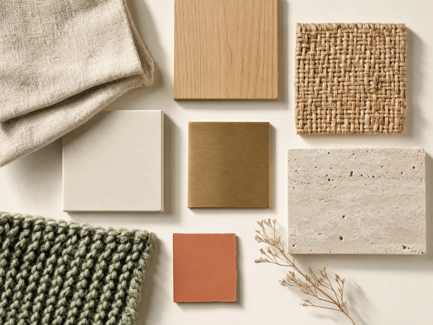
5. Build depth with texture and layers
When a neutral room falls flat, the culprit is almost never the color. It is the absence of texture. Variation in surface does the work that color contrast would otherwise do, which is why the calmest rooms still feel rich. An all-linen or all-velvet room reads one-note; range comes from mixing materials: nubby linen against brushed metal, a chunky knit throw on smooth leather, a jute rug under a ceramic lamp, woven baskets, wood grain, rough stone.
Textiles are the easiest, most rental-friendly way to layer this in: rugs, curtains, cushions, and throws add softness, absorb sound, and make a room feel lived-in. Think of it as building a texture scheme, not just a color scheme.
6. Balance it: scale, height, and the rule of threes
Balance is about distributing visual weight, how much each object pulls the eye, so no corner feels lopsided. Symmetry (matching lamps flanking a bed) reads calm and formal and is the easiest to pull off. Asymmetry (a tall plant balancing a piece of art and a table opposite) feels more dynamic and modern but takes a better eye. Either works as long as the weight is even.
For the styling on top, two rules carry most of the load. Vary scale and proportion so nothing dominates, an undersized rug or a too-small piece of art over a big sofa are the classic misses. And group objects in odd numbers, usually threes, in varied heights. The eye cannot pair off an odd group into a static pattern, so one piece becomes the anchor and the rest fall into balance around it. Varied heights keep the eye moving; three things at the same height read flat.
- Everything pushed against the walls, leaving a hollow center.
- A rug that is too small for the seating.
- One flat overhead light instead of layered lighting.
- Buying pieces before planning a palette and a layout.
- A fully matching furniture set, which reads like a showroom.
- Choosing paint without testing undertones against the floor and the room's light.
7. Decorating a single corner or awkward spot
Not every project is a whole room. An empty corner, an entryway, a blank nook, treat it as its own small vignette with one clear job. A reading nook runs on a simple comfort triangle: a seat, a light, and a landing surface, so a chair, a floor lamp, and a side table, finished with a cushion, a throw, and a plant. For an empty corner, a single tall plant, a floor lamp, or a leaning shelf instantly makes it look intentional. Emphasize the vertical and use slim-profile pieces so the spot does not feel crowded. Entryways follow the same logic: a console, a mirror to bounce light and double as a focal point, a lamp, and a tray for keys.
Part two: putting it into practice with AI
This is the part that used to be hard. Knowing the rules is one thing; seeing whether a sage palette or a bigger rug actually works in your room, with your floor and your light, used to mean guessing or paying for a designer's mood board. AI closes that gap. With an app that designs your room like Idori, you photograph the real space and try every decision above on it, before you buy anything. There are four ways in, depending on how clear your vision is.
When you don't know where to start: get AI ideas
For the moment a room feels off but you cannot name the fix, get AI ideas. Idori's AI, trained on real work from professional interior designers, reads and analyzes your actual room and proposes pro-level directions to lift it. Crucially, each one comes with its reasoning, what to change and why, so you are not just handed a look, you learn the thinking. "A jute rug and woven textures to warm up the bare corner" teaches the texture lesson from Part one on your own space. When a direction clicks, one tap visualizes it right on your photo.
When you know the vibe: apply a curated style
If you already know the feeling you want but not the details, skip the writing and tap a curated style. Idori applies a complete, considered look, the warm restraint of Japandi or Wabi-Sabi, breezy Coastal, bold Maximalist, and 13 more, with the palette, lighting cues, and texture choices already worked out. It is the fastest way to see your room wearing an entire aesthetic, and a great way to compare two directions side by side before you commit.
When it's one corner or one thing: pin a spot
A whole-room redesign gets you most of the way. For the last details, and for those single awkward corners, use Spot Edit. Pin up to four exact spots on your photo and tell Idori what each should become: swap the pendant for woven rattan, change the wall color, add a specific armchair to the empty corner. You can attach a reference photo to match an exact lamp or finish. Everything you did not pin stays exactly as it is, so you refine one decision at a time instead of gambling the whole room on a regenerate.
When you can picture it: brief it like a designer
If you can already see the room in your head, just describe it, the same way you would brief a professional. The more specific, the better: "warm Scandinavian living room, sage and oatmeal palette, low oak media unit, a jute rug under the sofa, two warm table lamps instead of the overhead." Notice that is just Part one written as a sentence: a palette, a focal arrangement, texture, and layered light. You can write it in any language, no need to translate your taste into English first, and Idori reads the intent and applies it to your real photo.
Then compare, and keep the best
However you got there, every result becomes a version in a browsable history. Slide between before and after to feel the difference, branch from any version to try a variation, like the same room in a cooler palette, and keep the one you love. When a version feels right, export it in full quality and save it or share it with a partner, a contractor, or a designer to make it real. This is the step that turns "a nice AI picture" into a decorating plan you actually trust.
Decorate your own room, from a photo
Idori is the app that designs your room: get AI ideas, apply curated styles, and refine precise spots on your real space. Free to start, no measurements needed.
Download Idori freeFrequently asked
Yes. Idori starts from a photo of your real room and restyles that exact space, keeping its walls, windows, and proportions, so you see your decorating decisions on your actual room rather than on a generic stock photo.
Start with the structure designers use: pick a palette, choose a focal point, plan the layout, then layer lighting and texture. If you cannot picture the result, get AI ideas, which read your actual room and propose directions with the reasoning behind each one, so you learn what to change and why as you go.
Use the 60-30-10 rule for proportion: 60 percent dominant color, 30 percent secondary, 10 percent accent. Then make sure the colors relate on the color wheel and that their undertones suit your fixed elements like flooring and tile. Testing a palette on a photo of your own room first removes most of the guesswork.
Idori is free to start, with a weekly credit allowance on the Free plan and the full library of 17 curated styles included, enough to decorate your first rooms without paying. AI Ideas and Spot Edit are Pro features, and no other interior design app on the App Store offers Spot Edit's level of precision.